


-73%

Select options
This product has multiple variants. The options may be chosen on the product page
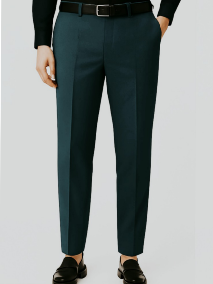 AQUA GREEN
 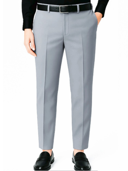 Light Grey
 👔 Men’s Regular Formal Pant – Bottle Green (W1)
Original price was: ₹999.00.₹270.00Current price is: ₹270.00.-69%
Select options
This product has multiple variants. The options may be chosen on the product page
-69%

Select options
This product has multiple variants. The options may be chosen on the product page
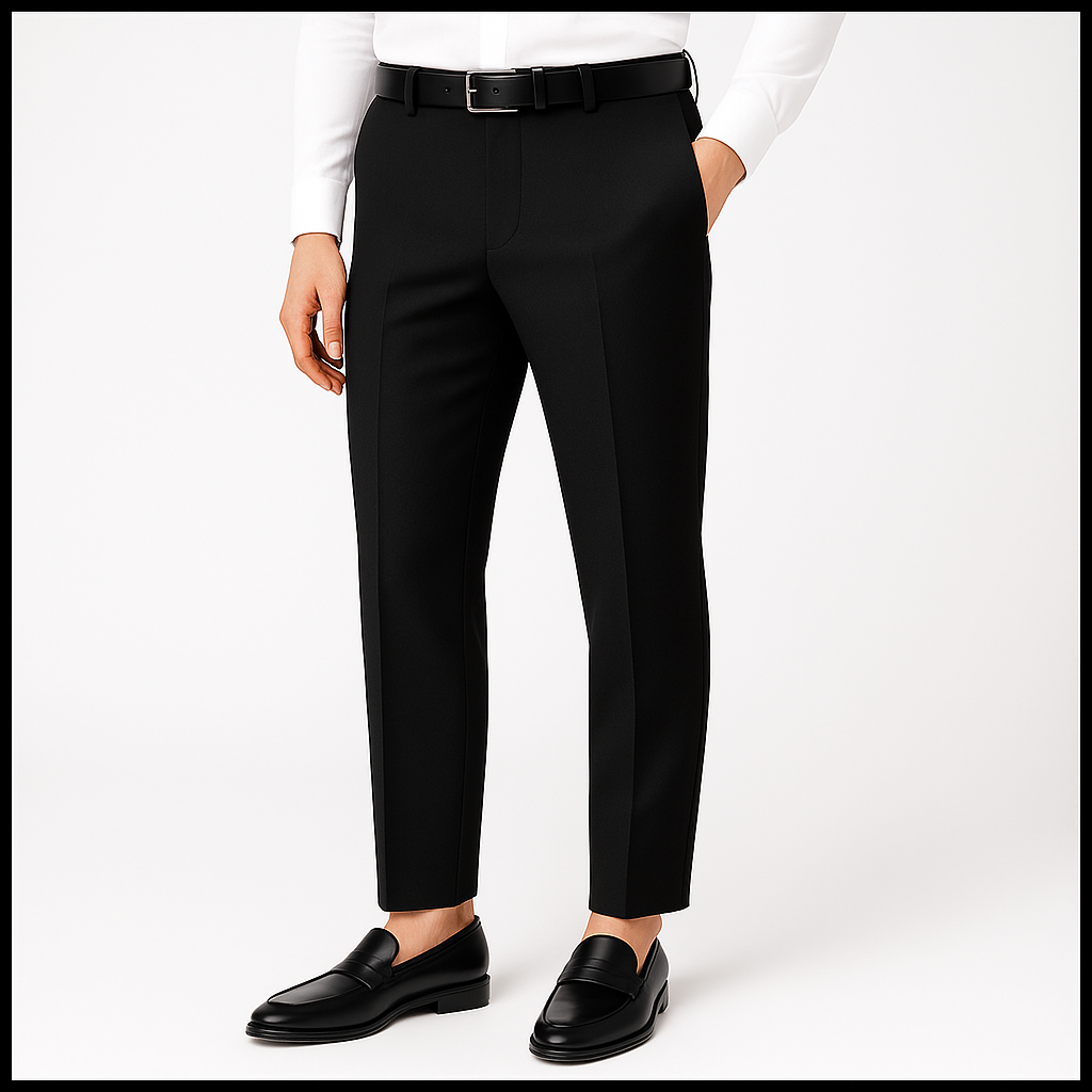
 Deep Wine
  Navy blue
 👔 Men’s Regular Stylish Good feel Formal Pant (T1)
Original price was: ₹1,250.00.₹385.00Current price is: ₹385.00.-64%

Select options
This product has multiple variants. The options may be chosen on the product page
Light Grey
👔 Men’s Regular Stylish Formal Pant – Screen Green & Light Grey (V1)
Original price was: ₹1,050.00.₹378.00Current price is: ₹378.00.-57%

Select options
This product has multiple variants. The options may be chosen on the product page
Stylish Fit Smart Look Formal Pant for Man
Original price was: ₹700.00.₹300.00Current price is: ₹300.00.-68%

Select options
This product has multiple variants. The options may be chosen on the product page
Mauve